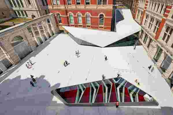
Starting on Friday, visitors to the Victoria and Albert Museum, Britain’s beloved repository of decorative arts, will get an unexpected lesson in cutting-edge architecture. A new courtyard entrance designed by Amanda Levete of AL_A, with sharp angles, swoopy curves, and more than 10,000 patterned porcelain tiles, will lead visitors into the museum’s existing galleries as well as to a vast new gallery below. For Levete, the project promises increased visibility after more than 30 years in practice. As a partner in Future Systems (with her late husband, Jan Kaplicky), she covered a department store in Birmingham in blue concrete festooned with 15,000 aluminum disks. At AL_A, the firm she founded in 2009, she designed a museum in Lisbon that The New York Times said “resembles a germinating seed.” And yet she insists her buildings are deeply contextual.
With the $70 million addition to the V&A, she hopes to prove that bold and contextual can coexist. Passing through the museum’s new gates on Exhibition Road, one enters what the V&A calls “the world’s first all-porcelain public courtyard.” It is nothing like the museum’s familiar red-brick campus. And yet as Levete and project director Alice Dietsch explain it, their design makes clear references to the original V&A buildings. Sometimes the references seem gimmicky (the new gates repeat patterns of shrapnel damage left on the building during World War II). But most of the decisions are sound. Moving through the spaces, one not only enjoys the world Levete created but also finds new vantage points for appreciating the museum’s architectural heritage.

The entrance, which the V&A calls “the world’s first all-porcelain public courtyard," will lead visitors into the museum’s existing buildings.
Levete won the commission for what is officially called the Exhibition Road Quarter in a 2011 competition, when AL_A was just two years old. “It was a thrilling win,” she says, “but I felt the weight of history and working with such an august institution.” Her design, she says, was derived from the fact that the addition would include a 10,000-square-foot gallery, which would transform the museum but would be hidden underground. “It was our quest to resolve a built-in paradox of the project: How do you make visible the invisible?” she says. Levete and Dietsch did that in a variety of ways. They inclined the courtyard to match the shifting ceiling heights below and added a huge skylight that appears behind a stainless steel “bumper” within the courtyard.

Guests of the museum will now have a new entrance to the vast new gallery below.
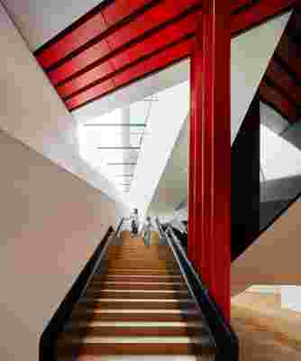
The new gallery, with a pleated ceiling, is reached by an elegant metal stairway inside the museum. Levete says it was important to put the stairway in one of the museum’s existing buildings, “so this is never seen as an annex to the V&A but an inextricable part of it.”
Levete predicts that “a large number, perhaps 50 percent” of visitors to the museum will come through the new entrance. Unlike the museum’s grand portal on Cromwell Road, Levete says, her courtyard “makes for an informal way of entering the museum. You just drift in off the street, and maybe stop at the cafe.” Given its connections to the surrounding district, she says, “it’s as much an urban as a cultural project.”
