
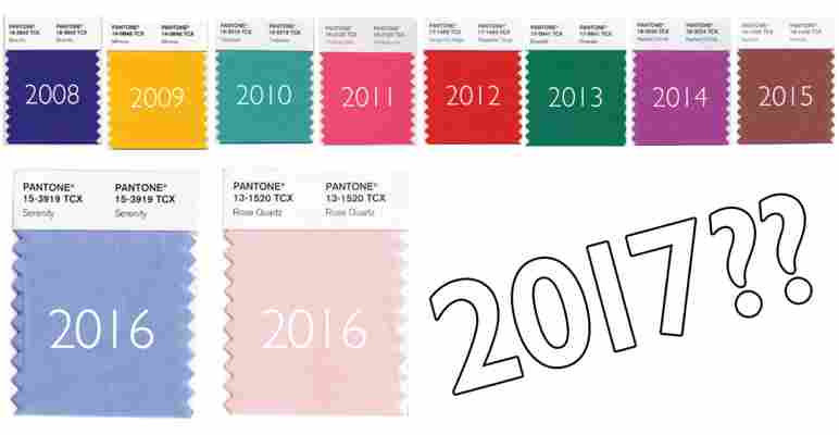
It’s December, and the holiday season is officially here. But for color lovers, today is a holiday in and of itself: the day Pantone announces their Color of the Year for 2017. In 2016, they surprised us all and gave us two hues: Serenity and Rose Quartz. Is there a new pair this year? Or are we back to one color to rule them all? Let’s find out:
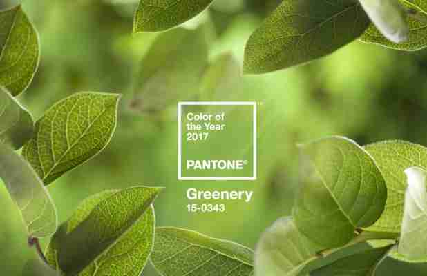
The 2017 Color of the Year is PANTONE 15-0343 Greenery , which the company describes as “a fresh and zesty yellow-green shade that evokes the first days of spring when nature’s greens revive, restore and renew.”
While we were expecting a darker hue or more neutral shade, Eleanor’s wild card prediction of leafy green last month is spot on.
She wrote, “it’s vibrant and hopeful, exactly what the world needs right now.” And Leatrice Eiseman, Executive Director of the Pantone Color Institute, echoes that sentiment:
While it’s a decidedly bright hue for interiors, Greenery is, as they put it, “nature’s neutral.” We’ll see the color work inside as the line continues to blur between indoor and outdoor living, and as the trend of decorating with plants, living walls, and terrariums shows no signs of stopping.
And here’s good news for those of us with black thumbs: “Bringing the outside in, the shade—like the plant life it represents—can improve self-esteem, reduce anxiety and heighten awareness of one’s surroundings.”
Eiseman makes some pretty bold statements about the daring hue:
A color of hope and revival—sounds like something we can get behind. But we want your take: What do you think of Greenery? Are you embracing the 2017 hue, or will you wait it out until 2018? Tell us in the comments!