After playing host to Fashion Week dinners (Prabal Gurung and Rosie Assoulin), a Vogue lunch, and the launch party for Aerin Lauder ’s collaboration with LoveShackFancy, American Bar has cemented its It restaurant status. For this new project, Kyle Hotchkiss Carone, alongside partners David Rabin and Jeff Kadish—whose restaurants include West Village’s Clover and its adjacent shop Clover Grocery —was inspired by private members' clubs like Mark’s in London and Stateside institutions like Chasen’s, Mortimer’s, and Swifty’s. The team, wanting to re-create the nostalgia of those spots, wondered: “What does a 1980s English members' club look like in downtown New York in 2020?”

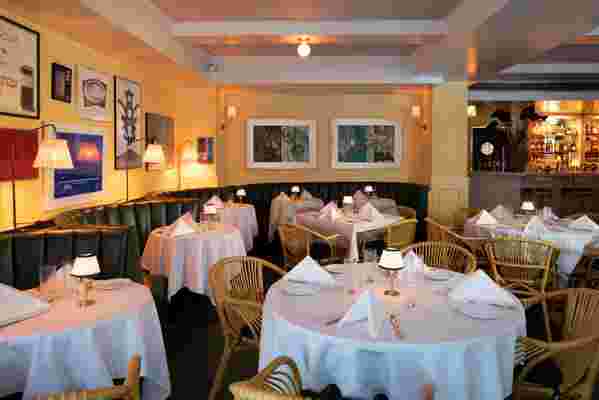
Contemporary art from Faye Wei Wei, British artist and designer Luke Edward Hall, and Clementine Crawford, along with NYC gallery exhibition posters from the 1980s and 1990s, adorns the walls.
The answer is hunter green banquettes, rattan chairs from Vimini e Bambu and Serena & Lily, Soane Britain lighting, soft yellow walls, and natural accents like a wicker bar cart to lighten the room. “We imported the exact rattan chairs that line the piazzetta in Capri, and we painted the walls the particular yellow that Sir John Soane chose for his drawing room because of its ability to re-create the glow of Mediterranean,” notes Hotchkiss Carone.
“The idea behind the drawings was to portray a sense of conviviality,” says Hall, who created original drawings for the restaurant’s menu and hand-painted lampshades for the sconces. “I wanted to show friends gathered and enjoying themselves in a colorful space.”
And that is exactly what diners seem to be doing at American Bar. “The restaurant is cozy, chic, joyous, and unfussy,” says fashion designer Gurung, who held his fashion show dinner there last week. “Flawlessly beautiful with straightforward American classics—and the burger is one of the best I’ve had,” he adds. Chef Carolina Santos-Neves is whipping up American classics like spinach-artichoke dip, a wedge salad, and chicken pot pie in addition to steaks and burgers.

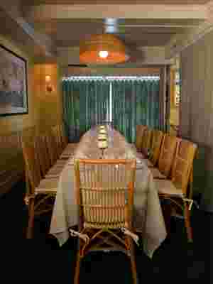
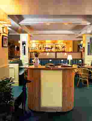
The restaurant is divided into three sections: a cocktail lounge at the entrance; the main dining room with an 18-seat terrazzo bar; and a private dining room, pictured here, in the back.

The restaurant was designed to be both a buzzy hub for NYC creatives and a warm, casual draw for locals midweek.
Hotchkiss Carone is happy that American Bar plays host to fashion-world friends but wants the boîte to be an approachable and laid-back local spot too. “Fashion is such an integral part of the fabric of downtown New York,” he says. “We live in a creative place, and a room full of people in fashion, music, art, entertainment is always most welcome. But so are the people who have nothing to do with that!” Aerin Lauder agrees: “American Bar celebrates all fabulous American things: design, food, and comfort.”
The ultimate resource for design industry professionals, brought to you by the editors of Architectural Digest
The space is divided into three sections: a cocktail lounge at the entrance, the main dining room with an 18-seat terrazzo bar, and a private dining room in the back. “The location and space had a very residential feeling that we leaned into with the design,” says designer Melissa Bowers—an alum of Studio Sofield and Faena Group before starting her own firm—who worked on the project. “We reconfigured the open kitchen to keep the guests in their own cocoon, lined with banquettes, mirrored columns, curtains, and more.” Bowers, it seems, tossed the restaurant design playbook out the window. “We wanted it to feel like something else: We wanted some nostalgia and to bring back some feelings from our youth—'80s; happy; Paris Bar Berlin; a watering hole, but with sophistication and edge.”
The initial concept for American Bar was drawn from London's private members' clubs in the 1980s.
And the restaurant’s design elements are emblazoned on a postcard designed by Hall that comes with the check: motifs like faces, the restaurant’s whippet logo, martini glasses, the leafy curtains, and accoutrements of a fun night out. “We wanted to bring a hit of London whimsy to this space—to not take ourselves too seriously or be too perfect or severe,” says Hotchkiss Carone. “Luke was in town for a few days last year, right when we were starting this project, and came to the space and spent an afternoon painting these lampshades. It’s our little homage to Bemelmans Bar, bringing something a little old-school and uptown to the West Village.”
