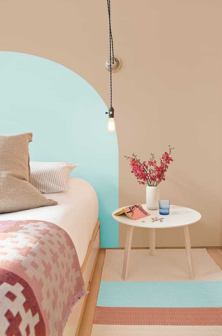
2020 has been the year of “ Go Big, Stay Home ,” and with that comes the focus on creating an indoor environment that’s comfy, cozy, reassuring , and—quite frankly—a place where you’re okay spending all your time in. A way to accomplish a calming effect at home is using color to shape the mood—and PPG Paints is coming to the rescue with not one, but three colors as part of its 2021 Palette of the Year.
Today, PPG introduced its three-part POTY called “Be Well” that embodies both nostalgic comfort and nature’s positive energy. Instead of doing a single color of the year , the paint brand is highlighting an entire palette that works toward achieving this wellness-focused balance. So, without further ado, say hello to the trifecta: Transcend (PPG1079-4), an oatmeal-colored hue; Big Cypress (PPG1062-5), a shaded ginger; and Misty Aqua (PPG1147-3), a watercolor cerulean blue.

“With the world sheltering in place for the better half of the year, we have begun to crave human connection and embrace simple activities, including walking, hiking, baking and gardening,” said Dee Schlotter, PPG senior color marketing manager, architectural and industrial coatings, according to a press release. “This organic and hopeful palette represents what we have been longing for after decades of overstimulation and over-consumption—simplicity and restfulness.”
According to PPG, the goal of this palette is to celebrate “beauty of all kinds” that prioritizes mental, physical, and spiritual health—something that the paint company identified as a need early on in their annual Global Color Workshop. This color story of “Be Well” uses the 60-30-10 design rule, with Transcend being 60 percent of the room, Big Cypress being 30 percent, and Misty Aqua being 10 percent.
As the dominant color, Transcend is the grounding portion of the palette, playing up earthy influences and nostalgia to create a cozy, neutral sensation. The PPG team describes the color as “a warm latte on a cool morning or warm sand on a sunny summer day.” Then there’s Big Cypress as the secondary hue, a shaded ginger with persimmon undertones that is described as “a big, comforting hug for your home.” And finally there’s the accent color Misty Aqua, which has a name that’s true to its tone. Blues have always been associated with having therapeutic qualities , so it only makes sense that one makes it into the POTY.
“When the world experiences events that cause unrest, anxiety and grief, we tend to naturally gravitate toward compassionate colors that allow us to create a personal retreat from the world,” said Schlotter. “These comfort colors are similar to comfort foods—both offering a certain sense of familiarity and normalcy when facing the unknown.”
So, here’s to the calming power of color—for this year, next year, and the years to come.
