While not exactly a chromophobe, Neal Beckstedt was never—by his own admission—an interior designer you’d go to for rooms bursting with color. Known for warmly modern schemes, where refined materials, rich textures, and sculptural furnishings tend to be the statement gestures, he has typically deployed color with a reserve that falls somewhere between judicious and parsimonious. And yet. . . .
When a friend connected him with a Hong Kong–based couple who were looking to renovate a Manhattan pied-à-terre, Beckstedt knew right away that the project was going to take him out of his chromatic comfort zone. “They loved color,” he says. “In particular, their art collection was supervibrant and bold. That became the starting point.”
Situated in a West Side building by architect Thomas Juul-Hansen, the two-bedroom apartment features an open living-dining space, with great natural light and enviable views overlooking the High Line. After dropping the ceilings a couple of inches to put in lighting—better for displaying artworks by the likes of Matthew Brandt, Steven Klein, and Marc Quinn—and installing some millwork for discreet TV cabinets and a bar, Beckstedt turned to the finishes and furnishings.

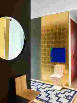
Gold leaf accents the entry. Vintage Gerrit Rietveld zig-zag chairs; Hsiao Chin painting.
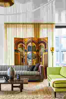
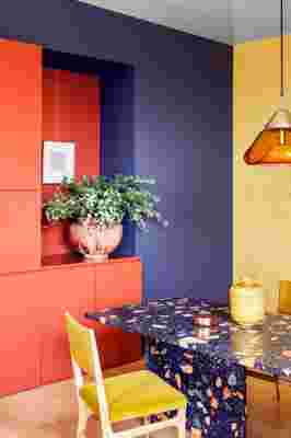
“It was clear that the clients were attracted to things that are a little avant-garde,” says the designer, whose initial acquisitions for the apartment included an eye-catching Max Lamb dining table made of engineered terrazzo. Speckling the table’s surface are flecks of bluish green, golden yellow, and punchy persimmon red—colors that Beckstedt adopted for neighboring walls and furniture fabrics. In the living area, he embellished walls with subtly patterned gold leaf, upholstered a 1950s Italian sofa in a teal velvet, and clad an Edward Wormley chaise longue in an acid-lime velvet with burgundy piping. Joining the mix are a Johnny Swing coin chair, a Deco-style folding screen, and vintage Jindrich Halabala lounge chairs covered in Mongolian sheepskin. The animated ensemble is reflected in the high-gloss ceiling, into which Beckstedt inserted a recessed oval detail. “It was all about how we could do a different take on things,” the designer explains.
In terms of color, the question became, “How far are we going to go?” Quite a bit further, it turns out. In the guest bedroom, Beckstedt used shades of teal for the bed, walls, and even the ceiling, which he contrasted with rust-colored curtains. For the master suite, meanwhile, he opted for a two-tone scheme, with deep burgundy-meets-aubergine colors on the bed and walls offset by the pale greens of the ceiling and curtains.


If this palette marks a departure for Beckstedt, certain hallmarks remain. “I’m always pushing pottery—there’s just a warmth and a depth to it,” says the designer, who chose ceramics ranging from a modern Berndt Friberg vase to recent sculptural vessels by the Haas Brothers. Also evident is his fondness for distinctive details, like the exposed selvage edges on the master bedroom’s coverlet and the variations in texture and pile on the living room carpet. Handwoven in South America, the rug adds an element of coziness while taking that space “down a notch, so it didn’t become too glam,” Beckstedt notes. Clearly, he hasn’t lost all of his reserve. nbeckstedtstudioom
