In the early decades of the 20th century, before the advent of the California modernist movement, Los Angeles’s vaunted indoor-outdoor lifestyle had not yet become the defining characteristic of the L.A. residential landscape. Most houses still clung to an earlier model of domestic architecture, one that posited residential space as a fortress against the incursion of nature. As a result, many homes were designed to look inward, with surprisingly dark rooms sheltered from the relentless Southern California sunshine.
Such was the case when designers Nate Berkus and Jeremiah Brent were commissioned to transform a stately but somewhat dour Tudor house built in 1925 in L.A.’s Hancock Park neighborhood. Their clients were Brian Robbins, president of the Nickelodeon network; his wife, stylist Tracy James; their young daughter, Stella; and Robbins's sons from a previous marriage, Justin and Miles. “These are people who have flexed a lot of creative muscle over the years in entertainment and fashion. They asked us to make the house less heavy and ornate, and more appropriate for a modern family—something friendly and warm,” Berkus recalls. “They’re not the kind of clients who have seven butlers pouring wine.”

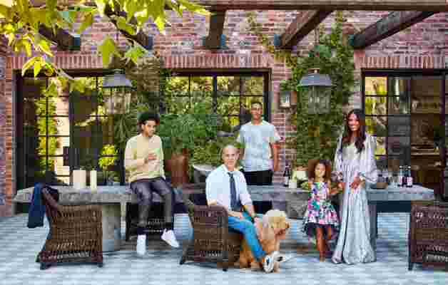
Brian and Tracy with children (from left) Justin, Miles, and Stella—and Brooklyn the goldendoodle—on an alfresco dining space. Janus et Cie arm chairs.
The challenge, according to Brent, was not simply the relative darkness of the interior spaces but also the home’s stiff, regimented floor plan and awkward circulation. “We asked ourselves, ‘Can we crack this thing open and make it fresh and new but still true to its roots?’” Brent explains.
The designers’ first order of business involved the consolidation of smaller discrete rooms to fashion more generous, airy spaces for the kitchen and breakfast rooms as well as the master bedroom suite. They also opened up the entry foyer and mezzanine gallery and installed new doors and windows of iron and glass throughout the home to usher in more natural light. “The front door is the only original door or window we left. Every layer we stripped out opened up the house and gave it an entirely different presence,” Berkus notes.
The living room, outfitted with a mix of pedigreed, centuries-spanning furniture and accessories, perhaps best exemplifies the light and bright spirit of the designers’ intervention. “We consciously kept the palette restricted to whites, off-whites, and neutral tones. This room was particularly dark, and now it’s one of the brightest spaces in the house,” Brent says. “Never underestimate the power of a fresh coat of white paint.”

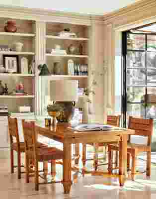
A table and chairs by Jacques Adnet anchor a sunlit corner of the family room. The 10th-century olive jug table lamp is from Galerie Half , and the custom iron-and-glass doors were made by Pinky’s Iron Doors .

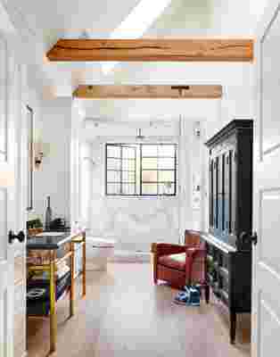
In Brian’s master bath, a Waterworks double vanity pairs with a Jacques Adnet–inspired cabinet and a 1940s French Deco armchair. The shower fittings are also by Waterworks.
Spruce modernist furnishings—including a pair of Pierre Guariche lounge chairs and a large, articulated Stilnovo sconce from 1954—sit lightly within the refreshed living room, mitigating the formality of the space. “Juxtaposing modern and contemporary pieces with the Tudor architecture creates an interesting tension. The soft, curved lines of the furniture instill a sense of fluidity,” Berkus observes.
The designers used a similar strategy to alter the character of the dining room, where the walls were formerly painted blue and the floor stained a shade of dark brown. After refinishing the floors in a much lighter tone and painting the room white, Berkus and Brent installed a set of classic Mario Bellini Cab chairs around the clients’ existing dining table beneath a graphic grid of overhead lights. “It’s sophisticated but young. We made it a happy space,” Brent says of the transformation.
The ultimate resource for design industry professionals, brought to you by the editors of Architectural Digest
Happy is indeed the word to describe the designers’ emendations throughout the home, from the voluminous master suite to Stella’s pink palace to the sunlit breakfast room that now opens to a new kitchen centered on a 17th-century limestone mantel cleverly converted into a hood for the stove. The reinvigorated landscape design, orchestrated by Brent working in tandem with the firm Rolling Greens, also puts a new complexion on the house, offering a variety of options for alfresco entertaining and leisure.
“We really fell in love with these clients. They were the kindest, most engaged people we’ve had the pleasure to work with, so we wanted to give them a home that truly reflects the beauty of their family,” Brent concludes. By all accounts, they’ve succeeded.
