Saturated bursts of full-bodied gem tones aren’t exactly standard operating procedure for Ashe + Leandro, the AD100 firm. But sometimes the best results come from having conventions challenged. Partners Ariel Ashe and Reinaldo Leandro started essentially from scratch to redo a 2,000-square-foot, three-bedroom apartment in the Sterling Mason building in Manhattan's Tribeca, taking major inspiration from Italian design firm Dimore as they went. What they didn’t know at the time was that their client was getting feedback and ideas beyond the scenes from her design-savvy sister. “They are a young family, not afraid to be bold and playful in their choices. We said, ‘Why don’t we do a Dimore take, bring some of that Milanese style to Tribeca?’” says Leandro. Ashe adds, “It turned out really cool in the end because it’s a lot more colorful than we usually do.”
The owners were game for anything and didn’t feel precious about any of their existing pieces, Ashe says, adding, “That’s always something I want to hear.” She knew they were more adventurous than she is personally, so the designer took the chance to dip a toe into a Technicolor pond. “I’ve been a fan of Dimore’s work and this just gave me an opportunity to kind of go crazy, which was fun. I showed them their work and they’re like, ‘Yeah, that’s great.’ So I was like, ‘Good, we’ll do the Ashe + Leandro version.’”

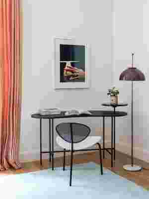
A sister of one of the homeowners lent the couple the photograph over the Gubi desk in the corner of the master bedroom, with a vintage Italian lamp. The coral curtains were existing, and they made the green rug at Ateliers Pinton. “I’ve noticed we always used black in every project, and so that was our black moment. And it made the peach and teal more palatable, I think,” says Ashe, “and less like Florida.”
Their iteration wound up supremely comfortable, plush and intensely colored, with plenty of original shapes and lines. Still, Ashe says, theirs is more pared back and simpler, yet still luxurious and vibrant. “Dimore would never leave a wall white, like we did in the bedroom, but it’s not that big of an apartment and you don’t want to be overwhelmed with color.” One aspect that’s purely Ashe + Leandro: the absence of pattern. “That’s very signature of us. We don’t ever use patterns, wallpapers, or fabrics, it’s just all about texture.”
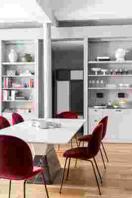
They recovered a couple of existing pieces in the living room in sumptuous velvets, influenced by a photo of Dimore’s work that Ashe had seen. Renovations weren’t necessary, but they did add a slew of bookshelves, a blue stone–topped bar adjacent to the dining table, and a large, colorful cabinet in the baby’s room, which looked fantastic but was a bit of a pain to construct. “It was more about creating program,” says Leandro of the built-in additions in the living room that formed a successful space for entertaining and lounging. “A bar area, more storage, TV, book, and object display—how to bridge all that new program in one consistent gesture and not little moments that would break up the great room that is the living and dining room.”
Ultimately, says Ashe, “It was different for us, but fun. I definitely am better at this than super tradition or super contemporary—it’s still in my favorite era, midcentury Italian.” The color may seem out of character but, says Leandro, it’s very present in their earlier work, though with more of a New World twist: “The difference is that our colors were more vibrant—I am Latin and Ariel is from New Mexico. These colors were a little moodier, more Milanese or Old World: deep reds, rust, gray-blues.”


RELATED: A Modern Tribeca Apartment Where Eclecticism Reigns
