Copenhagen is repeatedly named as one of the most sustainable, livable, and happiest cities on the planet. Synonymous with beautiful architecture and a paragon of people-oriented urban design, professionals shaping Copenhagen are in high demand across the globe. From elegant harborside architecture to prioritizing bicycles over cars, Copenhagen offers pragmatic—yet chic—solutions to 21st century urban challenges. Here are three Copenhagen-related principles to inspire architects and urban designers around the world.
IT'S ALL ABOUT HUMAN-SCALE
In the 1960s, dense traffic, parking lots, and dominating tower blocks began to replace Copenhagen’s traditional residential blocks and narrow streets. Its architects and urban designers found themselves at a crossroads: Would they continue to raze neighborhoods and pour concrete in the name of urban progression, or would they maintain the city’s traditional citizen-focused design?

The city's urban designers halted their 1960s push toward dense, concrete towers in favor of maintaining a more human scale.
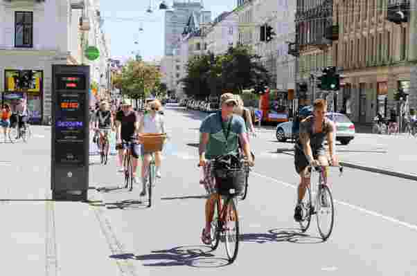
It’s clear to see which route they took. The city retains natural light, historic architecture, a strong bicycle culture, and a widespread pedestrian network—elements of the urban form that so many cities are now desperately trying to recover. Renowned urban designer Mikael Colville-Andersen explains that Copenhagen represents a “life-sized city” which doesn’t “overwhelm citizens with arrogant engineering or architecture.”

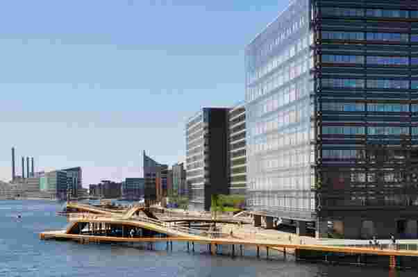
Much of the city is oriented toward the waterfront, encouraging recreation.
The city’s U-turn from a more aggressive approach to urbanism was not a mistake but rather a conscious and collective effort to ensure the city was built at a citizen level. “Copenhagen is a human experience at every turn,” where the “cross-pollination between engineers, urban planners, and designers and architects ensures a common vision and goal,” says Colville-Andersen.
CREATE “BIGAMY”

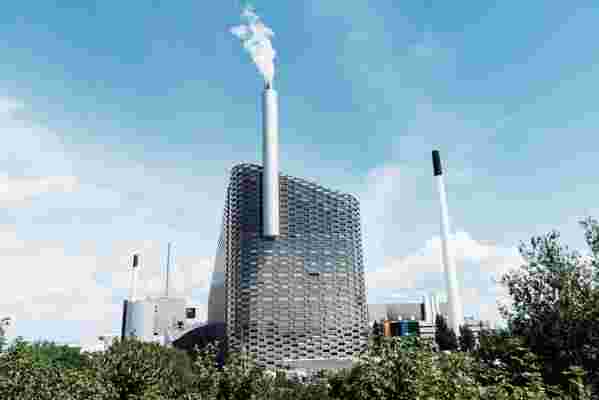
Copenhill, designed by BIG.
When Bjarke Ingels and his firm BIG were commissioned to design Copenhagen’s new waste-to-energy plant, they were determined to dream up a way to transform the negative stereotype of a power plant into a positive. The logic was simple: Why not make use of what will be a giant incinerator by also turning it into a ski slope? After all, Denmark gets cold but has no mountains.
Set for completion in autumn of this year, Amager Bakke (or “ Copenhill ,” as it has become known to locals), is set to be the world’s first plant of its kind, while also doubling as a leisure destination in its own right. The thinking is simple yet brilliant.
Islands Brygge brings the beach to the heart of the city.
“Rather than being faithful to a single expression, we prefer a certain promiscuity that allows us to engage in many different styles, vocabularies or ideas," says Ingels. “We call it ‘Bigamy’—the idea that we shouldn’t accept the limitations of established categories—and always attempt to merge conditions that are perceived as opposites or mutually exclusive. You don’t always have to choose between one or the other—often you can have both.”
Just a bicycle trip from Copenhill are a number of Ingels’ projects applying this very principle: Islands Brygge brings the beach to the heart of the city; 8 House combines retail, offices, houses, and apartments into a single building with a promenade and cycle track; and the Mountain Dwellings turns a car park into a housing project—complete with beautiful garden rooftops and a climbing wall thrown in for good measure.
All of this sounds like science fiction, but it’s the world-changing potential of architecture.
BE PLAYFUL
Today, Danish design is marked by a robust command of symmetry mixed with a degree of playfulness.
Likened to flies, Lego blocks, spaceships, diamonds, and toasters, the buildings composing Copenhagen’s skyline evoke intrigue and surprise through a sophisticated playfulness. “The thought of isms, of iconic buildings—which, regardless of context and function, represent a specific form of expression—is foreign to me,” says Dan Stubbergaard, founder of COBE. “If there is something that characterizes our projects and that I believe are their distinction, then it be the way they merge with the whole.… For us everything depends on the individual project—if it's a museum for rock music, we get inspiration from the world of rock music.”
While many of today’s architects of notoriety have gained recognition using a signature touch (think of Zaha Hadid’s undulating curves and Frank Gehry’s sweeping, metallic surfaces), Copenhagen is built upon an experimentation of new ideas unique to their context. “The city has become a 1:1 laboratory of our work in all scales. In its very nature, any piece of realized architecture represents a serious use of resources. We believe in exchanging these resources into increased livability for people,” says Stubbergaard.
The newer buildings that compose Copenhagen's skyline often push the envelope of traditional design, creating an interesting juxtaposition with the city's preserved historic façades.
A robust command of symmetry mixed with a degree of playfulness helped bring 20th century Danish architecture to an international audience (Jørn Utzon’s Sydney Opera House, for example). Such virtuoso experimentation continues to influence the design of Copenhagen today.
RELATED: There's Never Been a Better Time to Visit Copenhagen
