Clever flights of fancy and whimsical touches delight many a homeowner. But not this particular one, thank you very much. “This client wanted a machine for living,” says interior designer Charlie Ferrer of the “fastidious, disciplined, and pragmatic” rising young partner of a London-based law firm who hired him to design his bachelor flat in East London. As Ferrer explains, the project brief called for a “modern, functional, low-maintenance home that would serve as a physical and visual refuge from the busy city.” And though the New York–based Ferrer admits he tends to take a more layered approach in most of his work, he was more than up for the challenge.
Still, this wasn’t going to be the simple case of a busy client letting his designer make safe, efficient choices. That would have been easy, but perhaps not so interesting. As Ferrer explains, the client—for all his interest in pragmatism—is also very interested in art. He had even made some abstract paintings himself, which he planned to hang in the space. “He probably wouldn’t call himself an artist,” says Ferrer, “but he has a finely tuned eye for color and form.”

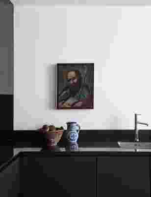
“We liked the way this painting gave a focal point to the dark kitchen,” says Ferrer of a religious canvas he found from a dealer in Madrid. The cabinets, originally white, were refinished in blue-black lacquer.

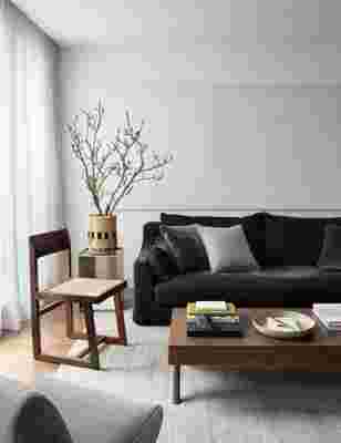
The painting on panel behind the sofa was made by the homeowner himself. “The client wanted it to almost fade into the background,” says Ferrer, who chose Little Greene ’s Loft White for the apartment’s walls.
Fortunately, the apartment offered the ideal blank canvas for the type of warm minimalism both designer and client agreed on. Located in a new construction building on a quiet street in Shoreditch, the one-bedroom, one-bathroom flat had high ceilings, plenty of light, and was in excellent condition. The client especially loved the floors of richly hued American walnut.
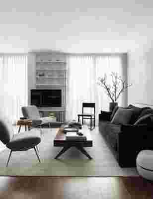
“The homeowner wanted to keep to a very limited palette, probably more limited than anything I’ve ever worked on,” says Ferrer. Each color, therefore, was chosen with special care. The warm brown of the walnut floor immediately became a building block of the apartment’s neutral tones. The client commissioned from Ferrer three pieces of custom walnut furniture—a dining table, coffee table, and entry cabinet in a style reminiscent of Pierre Jeanneret—and wanted the pieces finished to precisely match the floor. “He doesn’t like to mix woods!” says Ferrer with a laugh. “He loves woodworking and he actually ended up finishing them himself.”

Pale gray and black are the two other key colors in the masculine palette. Ferrer refinished all the interior doors in a matte light gray and used the same color for the living area’s chairs (which he covered in a gray Pierre Frey mohair) and flat weave rug. Black further defines the space; Ferrer left the original black granite kitchen counters undisturbed, then added a black Serge Mouille–style lighting fixture over the dining table, a black velvet custom sofa, and a “deep oceanic blue-black” lacquered finish to the kitchen cabinetry.
The ultimate resource for design industry professionals, brought to you by the editors of Architectural Digest
The designer’s final challenge was to give the streamlined flat just enough visual interest to keep it from being sterile. “I like things that feel animated,” says Ferrer, pointing to the subtle additions he made, like the 1950s ceramics found at a Paris flea market and a centuries-old devotional oil painting purchased from a dealer in Madrid. The most intimate touches of all, of course, are the artworks painted by the homeowner himself—a small black-and-white piece in the entryway and a large white-on-white painting on panel installed behind the sofa. And so what if they’re not exactly bursting with personality? They match the flat’s spare understatement perfectly. And considering who made them, they’re as personal as you can get.
