Boston’s intimate Beacon Hill is home to carriage houses that date to the 1800s (most, on cobbled streets that sparkle with gas lamps). This one, featuring design from LTK Interiors’ Lisa Kreiling, has been modernized for its relaxed residents. Still, it continues to embrace its historic bones in its decorative choices, which are smart and understated. “I was thinking ‘stable’ with some wood planking, some regular tongue and groove,” says Kreiling. “It’s rich and elegant with dark, mixed-width boards—but, not farmhouse.”
Remodeling this historic home demanded creativity and grace. (Remember, carriage houses were constructed for carriages and horses.) “Because they were more functional in nature, many of these carriage houses have quirkier design elements,” the homeowner says. These—including, odd-shaped windows, staircases in unconventional places, and wide floorboards—have naturally invited more creative interior design elements. “Our carriage house was designed to capture the essence of a functional carriage house, combined with an industrial feel and a sense of Europe and the Middle East, which are areas that we travel to very often.”

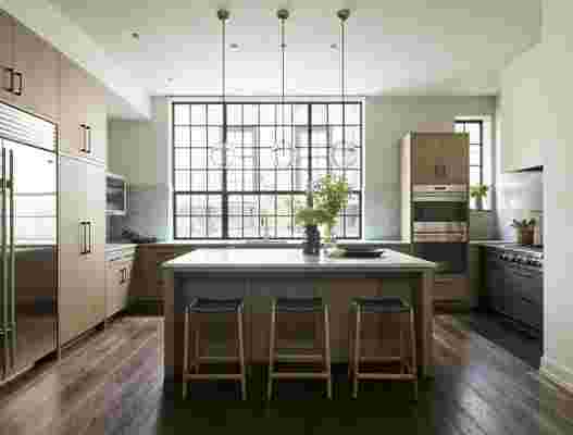
The light-filled kitchen is designed to function. Kochman Reidt + Haigh Cabinetmakers created the oak cabinets and the counters are from Waterworks . “I designed the stove with double ovens to be a standalone unit, so that it feels like a piece of furniture sitting in the space,” Kreiling says. The island is decorated with custom stools from Fyrn and light fixtures from RH .
The first floor—which is where the carriages would have been housed—has been transformed from dim to luminous. This is the result of inspired choices, like the creation of light sources: for example, the ceiling hatch in the entertainment room, which guides sun from the second floor. “We like the floor cutout between the first and second floors because it integrates the house—and our family—in a creative way while bringing light through from the skylight down to the first floor,” the homeowner says. In the rooms on the first floor, the marine-like hues (including Benjamin Moore’s Philipsburg Blue and Farrow & Ball’s Mole’s Breath) are meant to echo the colors of Boston’s Charles River.
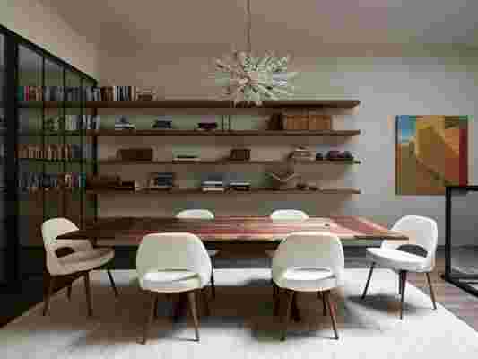
The stairs—once ramps for horses—have been fashioned from dark wood featuring metal balusters—one of the refined nods to the carriage house’s former function. These climb to the light-filled hub of the home on the second floor, which is broad and shared. The rooms flow in line from the dining and living rooms to the kitchen, which then looks down into the entertainment room. The one demarcation between these three spaces is a glass-paned partition between the dining and living rooms. Floating shelves on both sides of the glass-paned partition house the residents’ book collection. It’s both classic and modern. “This was a concept that we had come up with early in the beginning stages,” says Kreiling, looking back. “It’s a strong statement. It feels like you’re dining in a library, which is very suitable to Beacon Hill and the homeowners.”


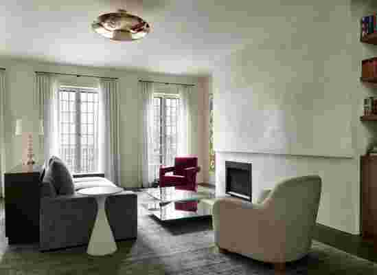
Here, in these spaces, the clean hues and lines make room for the design decisions to shine, from the contrasting floors to the furnishings. Some of the statement-making items are the rugs. “The one that’s in the dining room is silk with linen and it’s really beautiful in person,” Kreiling notes. “It has this super humble feeling but it’s very fine when you see it up close.” In the living room, one of the walls is covered in Venetian plaster. “It’s this really flat, really beautiful plane of hand-done Venetian plaster,” the designer notes. “It looks like icing on a cake; I want to eat it, it’s so pretty.”
The ultimate resource for design industry professionals, brought to you by the editors of Architectural Digest
In this carriage house, Kreiling has demonstrated that historic charm can find its place—and hold its own—in modern interiors. “The clients decided that they wanted to be more modern but still livable,” says Kreiling. “It’s not cold and hyper sleek. But, it doesn’t feel decorated. There was no matching the pillows to the drapes!”
