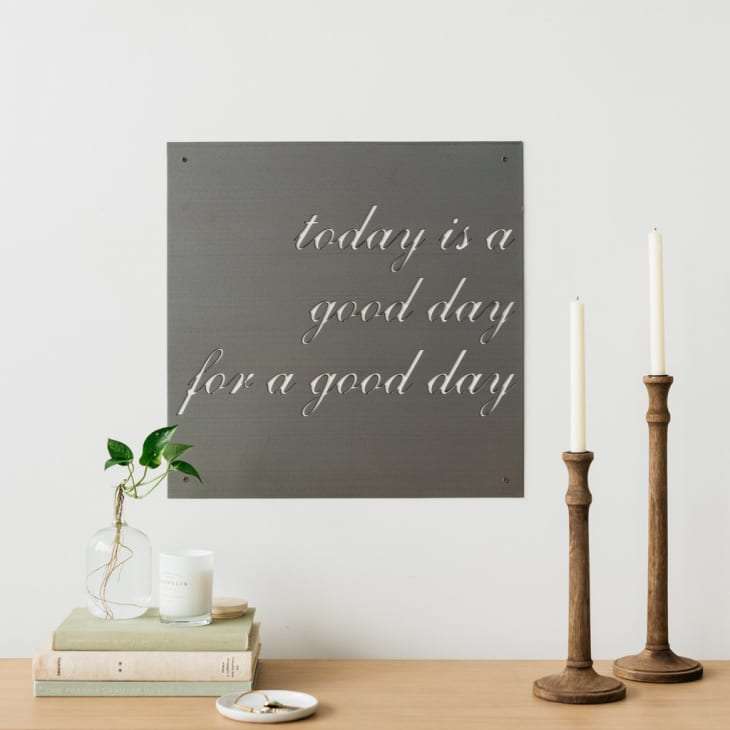
It’s a common decorating mistake . You go over to your most stylish friend’s new place with a five dollar bottle of wine in hand, ready to be impressed by her well-appointed decor. The door swings open, and right over your friend’s shoulder you see it: A “Live, Laugh, Love” sign telling you what to do before you even step foot into the house.
You smile politely as she shows you around, but you can’t help looking at that sign and cringing. Why exactly do we consider word art cheesy, and how did we get here? And what’s so bad about a sign declaring you’re standing in a “Cucina Italiana” or a cheeky “Be Our Guest” canvas hanging in a spare bedroom, anyway?

Word art has been around for decades, but the trend hit peak saturation right after the most recent recession. People couldn’t afford to decorate their walls with original works of art, so instead, they set their sights on bargain bin word prints and signs . Since this was during a time when people didn’t know if they would lose their jobs or be able to pay rent, a plucky sign that said “Blessed” or “Pilates? I Thought You Said Pie and Lattes?” was, in a strange way, comforting.
At the height of this trend, even Joanna Gaines was on board, commissioning word signs galore on “Fixer Upper” from metal craftsman Jimmy Don Holmes. This kind of mainstream exposure probably only added fuel to the word art fire. And you know what? Sometimes you, me, and even Joanna Gaines just wants to look at something easy. It’s like coming home after a long day and putting on a Hallmark movie or rewatching a “Friends” episode instead of diving into “Succession”. Life needs fluff, and so it seemed, decor did too.
Of course, cliches are hard at work in word art , and this is another source of word art’s rise to ubiquity—and our love-hate relationship with it now. Cliches, by definition, don’t say anything new. As Nigel Fountain, the author of “ Clichés: Avoid Them Like The Plague “, wrote, these ready-made phrases are “confirmation of the mundane, the expected, the banal.” But that’s exactly what makes them, at least to some extent, palatable.
In a 2012 NPR episode of Talk of the Nation , the pros and cons of cliches were discussed. All the callers had one thing in common: Canned phrases helped them in some way, whether it was an adage their grandmother used to say to console them or just a common mantra to help stay cool in out-of-control situations. So maybe that “ Work Hard & Be Nice to People ” poster hanging over your friend’s desk is there for a reason. It is a sweet sentiment.
There also is the discussion of whether word art can even be considered art at all or if it’s just a lazy substitute for something that’s meant to be personal and cerebral. “It’s a trite shortcut to the feelings you should get from art if you have any level of introspective ability,” says Celby Devereau, an Austin-based director of content strategy. “ Word art circumvents the internal discourse that happens when you see a piece of art and have to decide if it’s joyous, empowering, and so on.” In other, well, words, word art doesn’t leave room for subtlety or complexity. The message is clear: “Love is All You Need,” and “Donut Worry. Be Happy.”
Moreover, word art was also more original ten or so years ago, when it first started coming on strong. But as affordable art companies like Minted , Society 6, and Tappan Collective have grown in popularity and made artists’ back stories known and their works readily accessible, we’ve come to want more unique pieces. Our homes are meant to be a reflection of ourselves, and we each like to think we’re one-of-a-kind and nuanced.
So when you see something hanging over someone’s sink that’s also in your neighbor’s house, your eyes might roll because you’re disappointed with their generic choice. And that’s why word art has fallen out of favor a bit—for its impersonality and try-hardness. “It’s forced emotion—especially with art, you should feel whatever it says without having to read it,” says Sydney Cooper, a public relations manager in Brooklyn. “I’d prefer an eclectic bowl that makes me want to actually eat, pray, and love the people I’m sharing a meal with.”
Beyond the cliche factor, by using a few choice phrases, word art also seems to have captured a simplified, ideal version of life that we’ve figured out is not quite attainable—at least, for most of us. Many pieces paint life as perfect or ideal. But in reality, life is confusing, silly, and a downright struggle, and people are starting to realize that. And that’s yet another reason why word art is starting to get phased out. “ Word art posters and slogans are cringey because they speak to a very small demographic of privileged people who seemingly don’t have any major issues in life to contend with,” says Rae Tilly, the Berlin-based editor-in-chief of Yeoja magazine . Think about it: When was the last time you saw a sign or print that said, “I’ll be paying off student loans until I’m 50”?
So where does that leave us? Well, there are still plenty of people who find comfort in easy mottos and trendy jokes, like “Save the Drama for Your Llama.” And you know what, if you’re one of those people and that makes you happy, then go get your word art on. It’s your home, after all. And in a gallery wall arrangement or one or two other spots in your home, they’re totally fine. But if you find a slightly more personal and open to interpretation piece of art for your walls, you just might have a conversation starter on your hands that you’ll never get out of a “Live, Laugh, Love” sign.
